

Euan’s Guide
Brand Identity
Ramping up the Euan’s Guide Brand
Euan’s Guide is an award-winning disabled access charity founded by the late Euan MacDonald MBE and his sister, Kiki. EuansGuide.com, helps thousands of disabled people, families and carers find and review accessible places, with the goal of making the world easier to navigate for all.
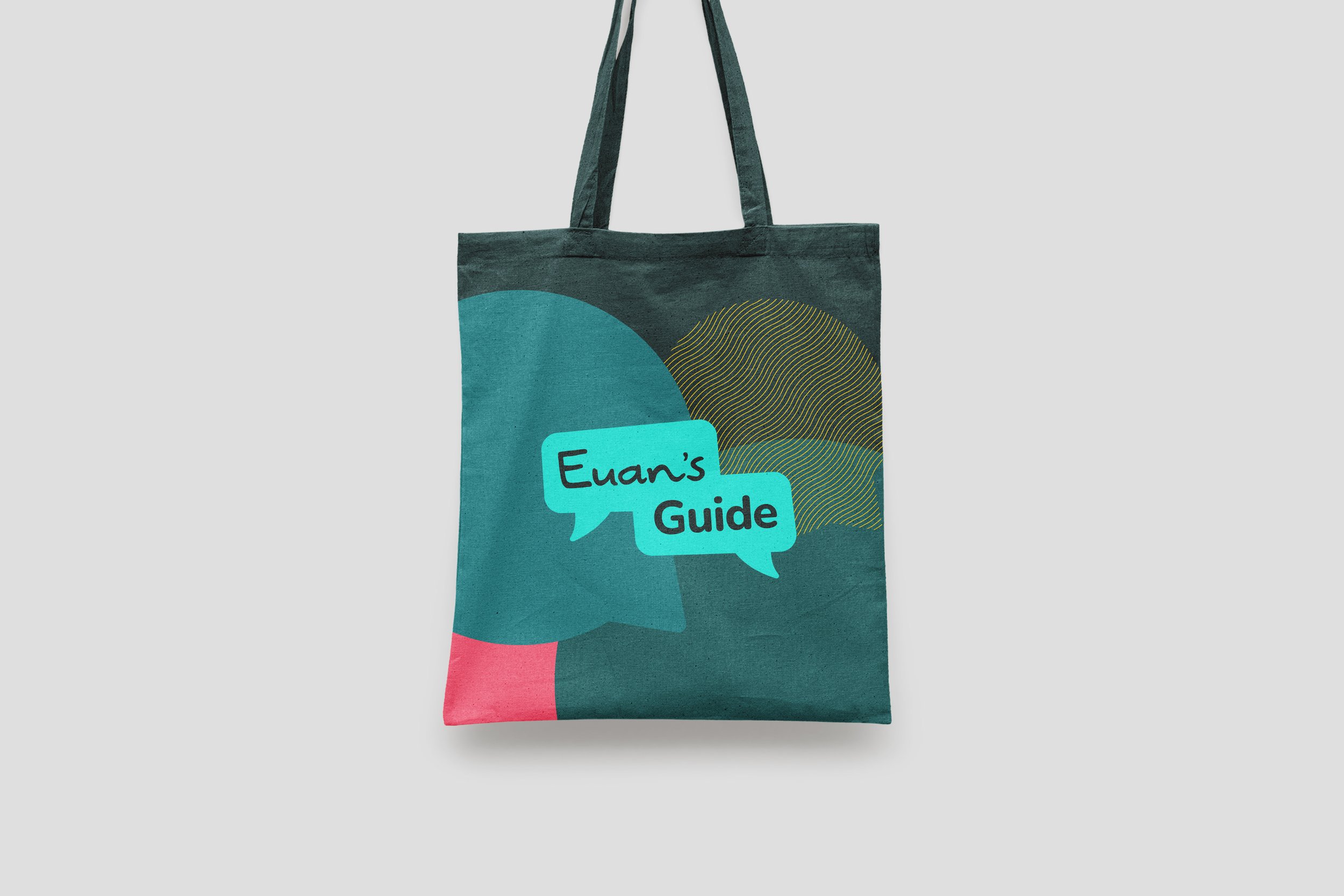
After more than a decade, Euan’s Guide recognised the need for a more accessible, professional and future-facing identity. We refreshed the brand with this in mind, retaining their iconic teal for clarity and redesigned the logo using Euan’s own handwriting to create a lasting, meaningful legacy.
Previous LogoBuilding Community
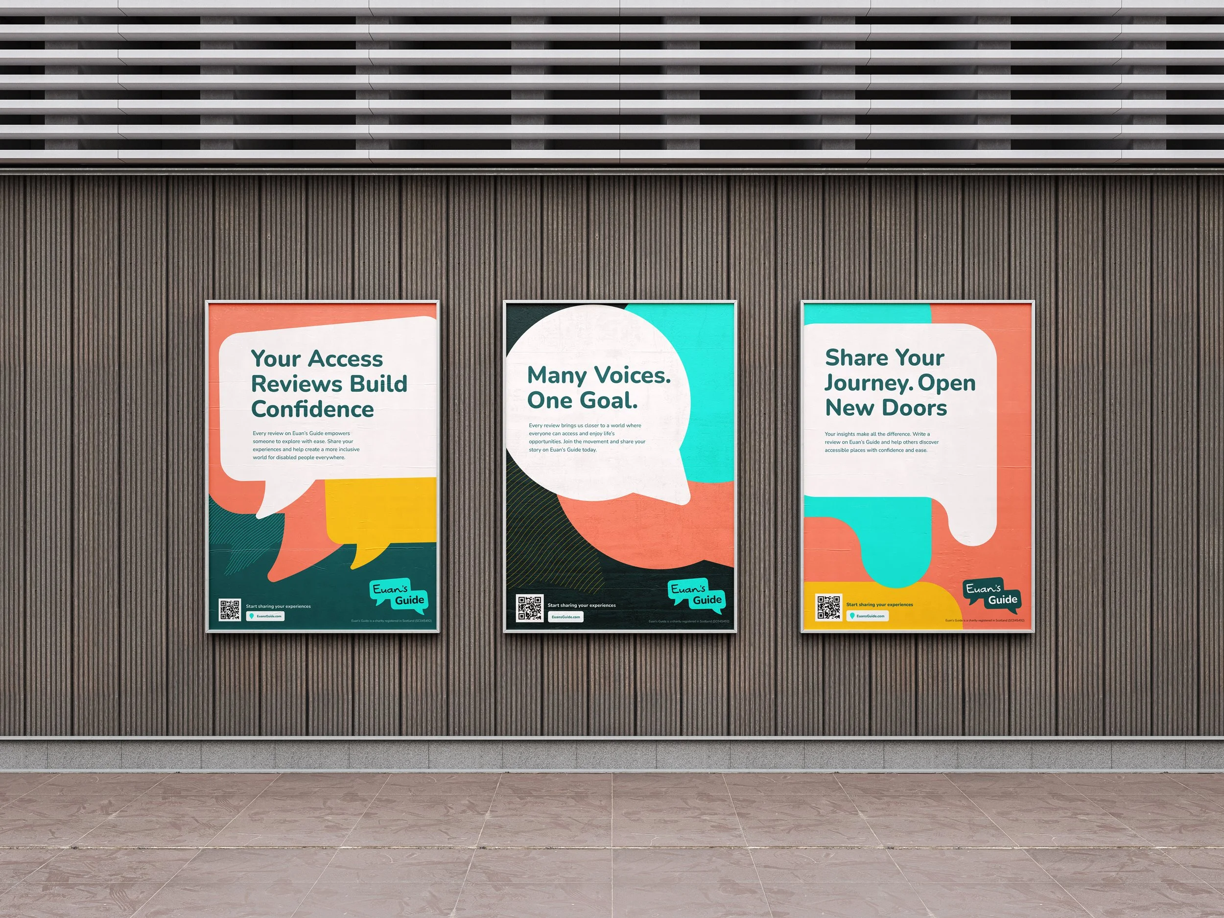
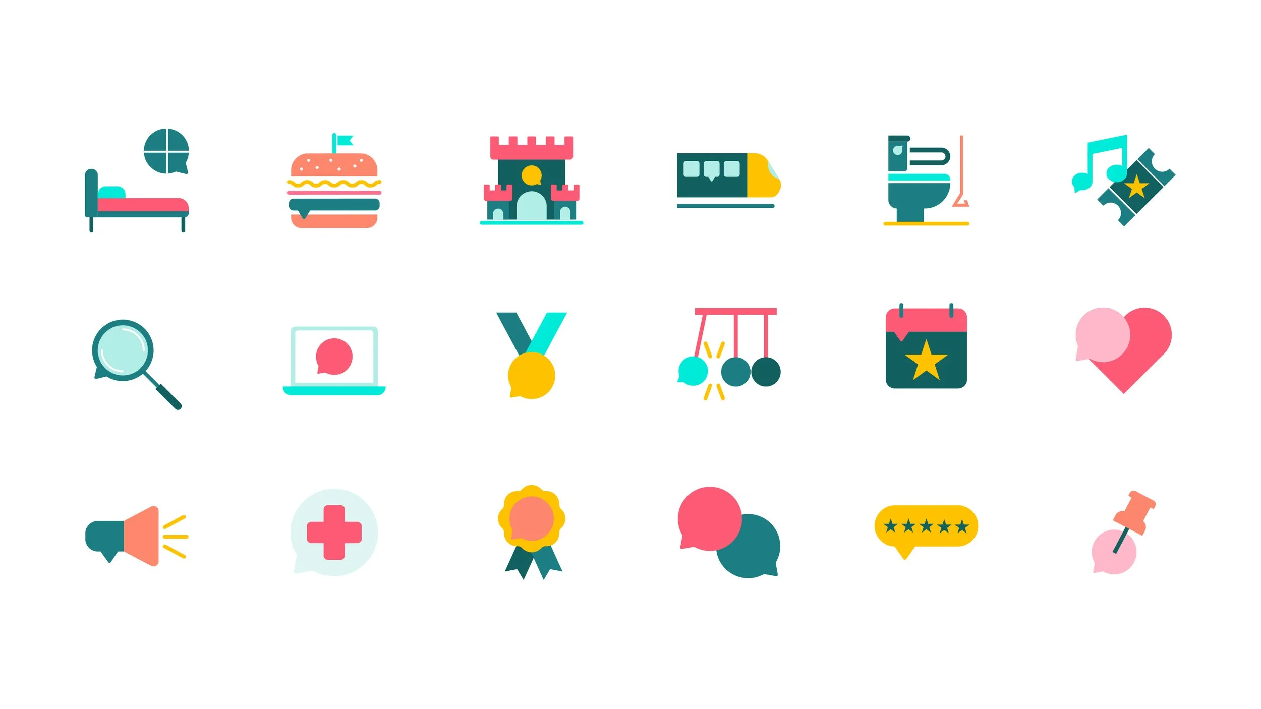
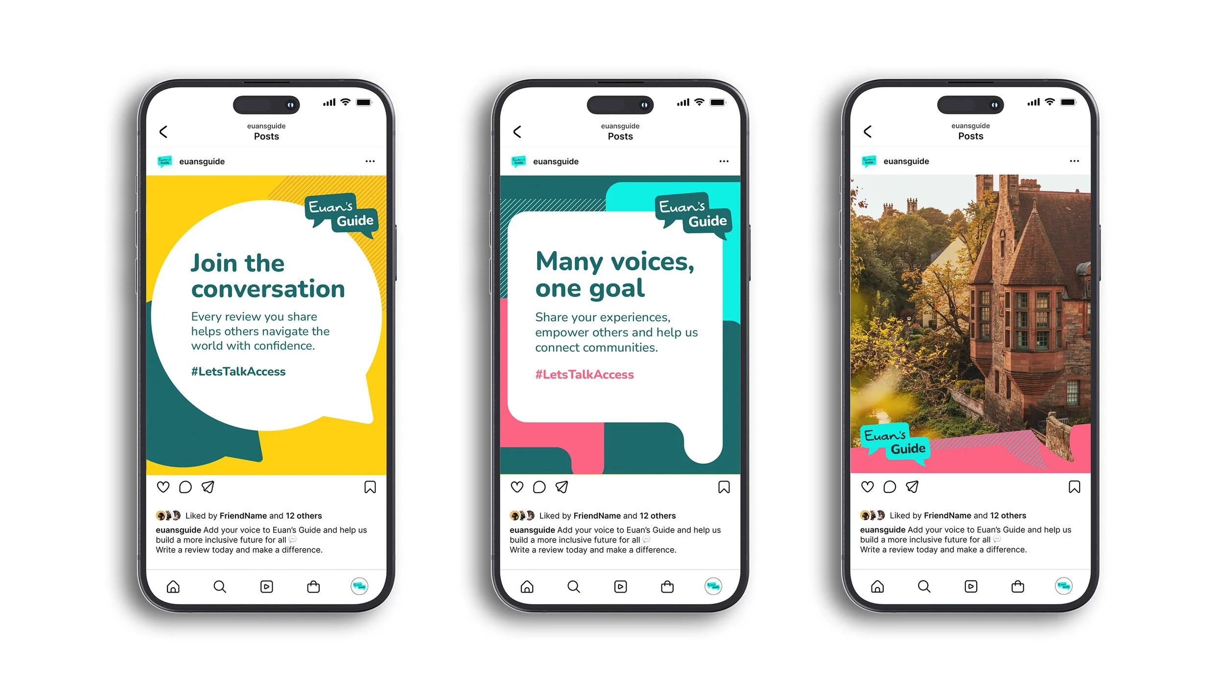
Speech bubbles were a key asset in the previous brand, so we felt it important to maintain some continuity and develop a more robust but easy to use bubble system, truly ownable by Euan’s Guide. This flexible system of bright, expressive assets reflects the charity’s inclusive, supportive and optimistic tone, and allows each piece of collateral to feel unique but still tied to a unifying brand system.
The original logo included a single speech bubble and we developed this to have two, reflecting the ongoing conversations about accessibility and the many voices that bring the Euan’s Guide community together, both online and offline.
The updated brand has being rolled out across a major website redevelopment and a suite of campaign, digital and print materials and has been designed to make it easier for the in-house team to bring the brand to life across everything from social media and posters to emails and exhibition stands.


Accessibility is King
As a disabled access charity, it was crucial that their new brand adhered to the highest levels of visual accessibility.
To ensure this was the case we undertook rigorous typographical and colour testing once the creative direction was established.
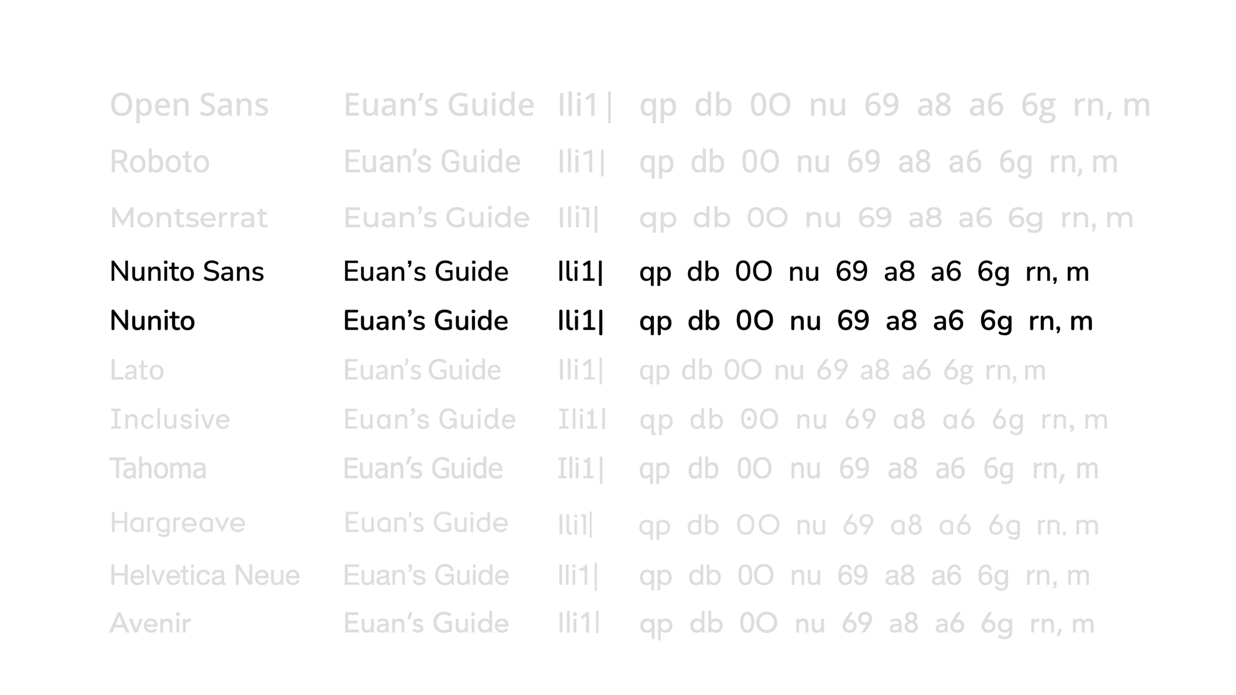
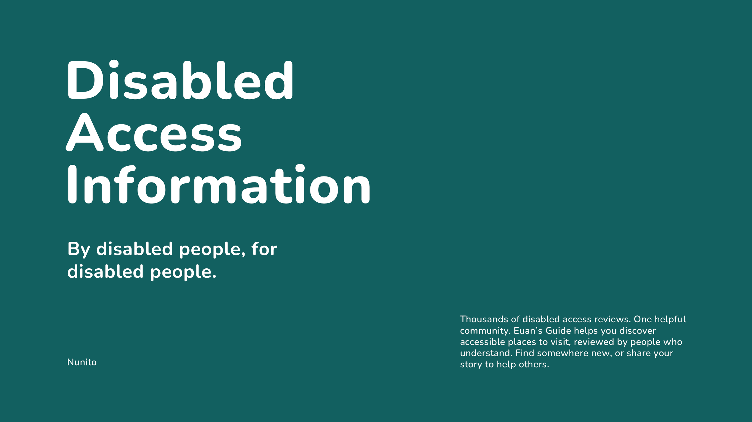
Exploring a whole host of accessibly strong typefaces, Nunito and Nunito Sans stood out as the only typefaces that rendered key vertically-lined characters entirely uniquely and made for a friendly and easy to read typeface, both large and as smaller body copy.
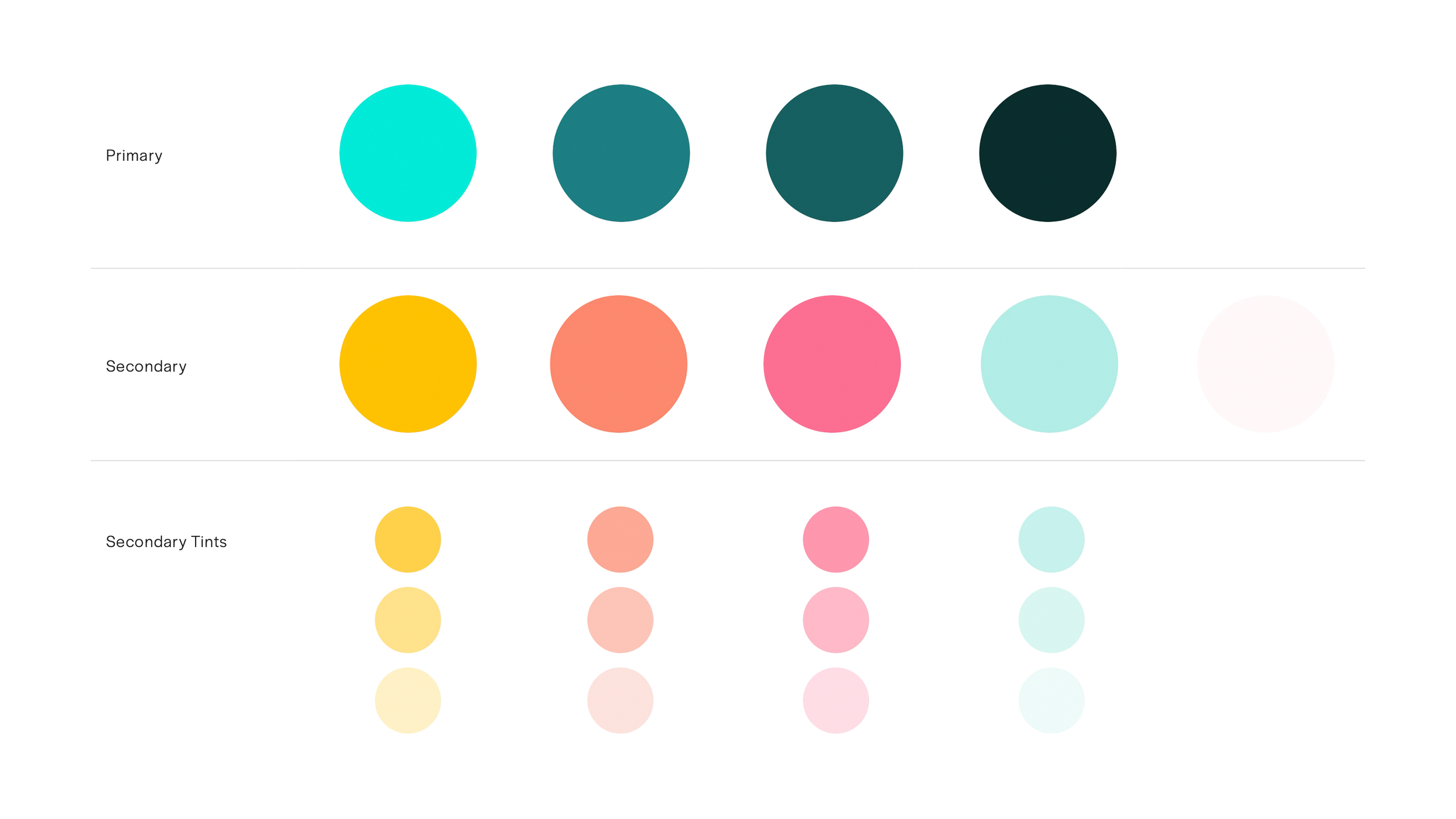
Colour also undertook as stringent a test process, ensuring that both primary and secondary colours were at least AA accessible with either the lightest coloured or the darkest coloured text being used over them. Tints were also added to provide just a bit more colour flexibility and depth.
These are important steps and ensure as smooth a brand rollout as possible.


Consolidating the Sub-Brands
As well as the core brand, we were also tasked with overhauling two of their existing initiatives, Safer Toilets and Access Survey; the UK’s largest and longest running annual survey on disabled access. The previous brands were disparate and not particularly linked to the core brand, so using the bubbles again as the common graphical element and some bold iconography, we developed two simple and memorable brand marks that very much fit into the Euan’s Guide family.
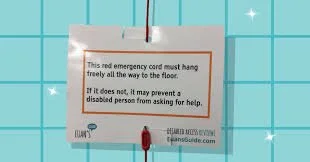
Following launch, this will also be rolled out over the coming months across social media, iconography, print and their ever-popular Red Cord Cards.
Previous Creative“DUO have been a much valued creative partner for us over the last 10 years. What continually stands out is their ability to turn what we think we want into what we actually need, combining strategic insight with beautiful design. They’re fast, reliable and, most importantly, accurate.”
– Antonia Lee-Bapty, CEO
If you have a project you’d like brought to life, please get in touch.